
One globe lamp can quietly finish a room. The right globe lamp colors can also become the room – casting warmth over a reading corner, adding jewel-toned drama to a dining space, or bringing a soft, artistic glow to an entryway that felt forgettable before. This guide to globe lamp colors is for anyone who wants more than basic lighting and is looking for a piece with personality, craftsmanship, and lasting visual impact.
Why globe lamp colors matter more than most people expect
When people shop for statement lighting, they often start with size, shape, or where the lamp will go. Color usually comes next. In practice, color is what people feel first. Before anyone notices the hand-set mosaic glass or the elegant silhouette of the base, they respond to the mood the lamp creates.
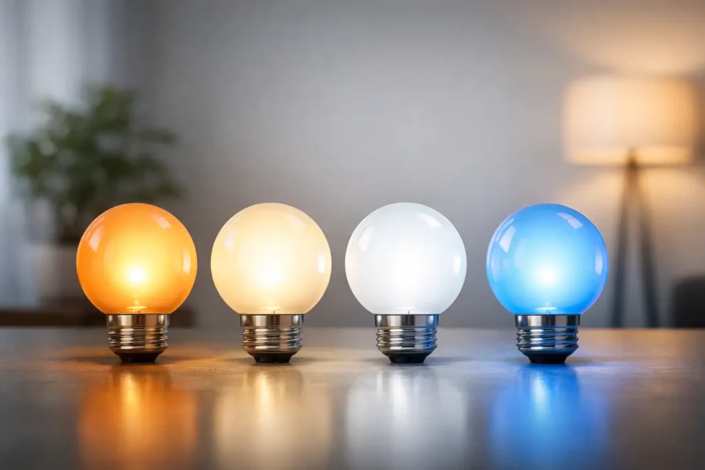
That is especially true with Turkish mosaic lighting. A globe lamp does not simply reflect color during the day. At night, it transforms color into atmosphere. Amber reads inviting and intimate. Blue feels calm and collected. Red adds richness and energy. White and clear glass can feel airy, crisp, and refined. Mixed palettes create a layered glow that feels storied rather than standard.
The best choice is not always the most dramatic one. It depends on how you want the room to live. Some spaces need a quiet glow. Others deserve a little spectacle.
A guide to globe lamp colors by mood
If you are choosing from a wide range of handcrafted mosaic globe options, it helps to begin with emotion before décor rules. Ask yourself what you want the space to feel like after sunset.
Warm colors for intimacy and comfort
Amber, honey, gold, copper, and soft red tones create a welcoming atmosphere that flatters almost every room. These colors are especially beautiful in living rooms, bedrooms, and dining areas where you want the light to feel cozy rather than bright. They pair naturally with wood, cream upholstery, walnut finishes, and brass accents.
Warm palettes are also forgiving. If your room already has mixed materials or a slightly eclectic look, a lamp with amber and gold mosaic pieces tends to pull everything together. The result feels collected and luxurious without looking too formal.
Cool colors for calm and clarity
Blue, aqua, teal, and green globe lamps bring a more tranquil energy. These shades work beautifully in bedrooms, reading nooks, spa-like bathrooms, and quiet corners where you want the lighting to relax the eye. In homes with white walls, stone surfaces, or modern furniture, cool-toned lamps can add color without feeling heavy.
There is a trade-off, though. Deep blue can be serene, but in a room that already lacks warmth, too much cool glass may feel distant. That is where mixed mosaics can help. A touch of cream, gold, or soft purple within a blue lamp keeps the look balanced.
Jewel tones for drama and richness
Ruby, sapphire, emerald, and amethyst-inspired combinations are made for interiors that want presence. These colors shine in entryways, dining rooms, boutique spaces, and hospitality settings where lighting should leave an impression. They feel expressive, artistic, and a little romantic.
Jewel tones are often the right answer when a room looks polished but not memorable. A handcrafted globe in a vivid mosaic pattern can break up neutral furniture and give the space a signature moment. If you love bold décor but do not want to repaint walls or commit to colorful large furniture, this is one of the easiest ways to bring in personality.
White and neutral tones for softness and versatility
White, cream, and clear-based mosaic globes have a lighter touch. They suit minimalist rooms, airy coastal spaces, and transitional interiors that need subtle elegance more than high contrast. They can also work as a bridge when you want artisanal detail but prefer a quieter palette.
Neutral lamps are versatile, but they should not feel flat. Look for texture, pattern variation, and craftsmanship in the glasswork so the lamp still carries visual interest when it is not illuminated.
How to match globe lamp colors to your room
A beautiful lamp can still feel out of place if the color ignores the room around it. The easiest way to choose well is to look at three elements already in the space: your dominant tones, your accent colors, and the quality of natural light.
If your room is built around neutrals like ivory, taupe, beige, gray, or wood, you have freedom. Almost any globe lamp color can work, so the decision becomes one of mood. Warm mosaics will make the room feel richer. Cool mosaics will sharpen and freshen it. Jewel tones will create a focal point.
If the room already has strong accent colors, coordination matters more. You do not need an exact match. In fact, exact matching can feel too calculated. A better approach is to echo the room with one or two related tones. A navy chair can connect beautifully to a lamp with blue, silver, and cream glass. Terracotta pillows may pair better with amber, red, and gold than with stark white.
Natural light changes everything. A room flooded with daylight can handle darker, more saturated mosaics because the lamp will still feel lively during the day. In a dim apartment corner or hallway, lighter tones and reflective glass often look more radiant.
Choosing between single-color and multicolor globe lamps
This is one of the most common design decisions, and there is no universal winner.
Single-color globe lamps look more tailored. They are ideal when you want the silhouette and craftsmanship to speak clearly without too much visual competition. They often suit modern spaces, symmetrical styling, and rooms where the lamp is meant to harmonize rather than dominate.
Multicolor globe lamps feel more expressive and traditional. They reveal more pattern, more sparkle, and more of the handcrafted Turkish mosaic character that makes these pieces unforgettable. If you want your lamp to start conversations, multicolor is usually the stronger choice.
It also depends on scale. A smaller accent lamp can carry a busier mosaic because the footprint is compact. A large floor lamp or multi-globe chandelier with intense color variation will naturally command more attention, which may be exactly what you want in a grand room and too much in a quieter one.
The best globe lamp colors for popular spaces
In living rooms, amber, blue-gold mixes, and rich jewel tones tend to perform beautifully because they create atmosphere without harshness. For bedrooms, softer blues, warm creams, and muted multicolor mosaics usually feel restful. In dining rooms, red, gold, and deeper mixed palettes add intimacy and make evening gatherings feel special.
For entryways, this is the place to be bold. A striking globe lamp can set the tone before a guest sees anything else. In condos or smaller homes, a brighter mosaic with white or clear glass can keep the statement feeling elegant rather than crowded.
In boutique spaces, salons, cafés, or hospitality interiors, color should support the brand experience. Warm jewel tones feel inviting and memorable. Cooler palettes can look sophisticated and modern. The right answer depends on whether you want guests to feel energized, relaxed, or transported.
When customization makes the difference
Sometimes the perfect lamp is not about finding a standard color. It is about creating a composition that belongs in your home. That is where customizable globe colors become especially exciting.
If your room has a unique palette, a custom combination can pull from your rug, your artwork, or your upholstery so the finished piece feels intentional. This is also ideal when you are selecting multiple globes for a chandelier or floor lamp and want a balanced mix instead of a random one. A family-owned specialty retailer like Whispers of Istanbul understands that color is personal, and customization allows that personality to shine through.
Customization is also practical. If you are worried a fully red lamp will be too intense, a mixed mosaic with red, amber, and cream may give you the richness you want with a softer result. If all-blue feels too cool, adding gold can completely change the mood.
Common mistakes to avoid
The biggest mistake is choosing only by daytime appearance. Mosaic lamps are lit objects, and their true character appears when illuminated. A globe that looks subtle in daylight may glow brilliantly at night. Another common mistake is ignoring the room’s emotional purpose. A lamp for a bedroom should not necessarily create the same energy as a lamp for an entertaining space.
It is also easy to underestimate how much handcrafted variation matters. That variation is part of the beauty. Slight differences in glass placement, tone, and pattern make each piece feel authentic rather than mass produced. If you want a room with soul, that is not a flaw. It is the point.
The most memorable interiors rarely play it too safe. They choose lighting that says something – about taste, warmth, artistry, and the kind of home being created. If you are deciding among globe lamp colors, trust both your palette and your instinct. The right one will not just match your room. It will give it a glow people remember long after they leave.
